Kitchen Finishes and How to Choose Them Wisely
Choosing a color palette is a key part of interior design. Color affects the perception of space and atmosphere. Here are some practical tips from designers.
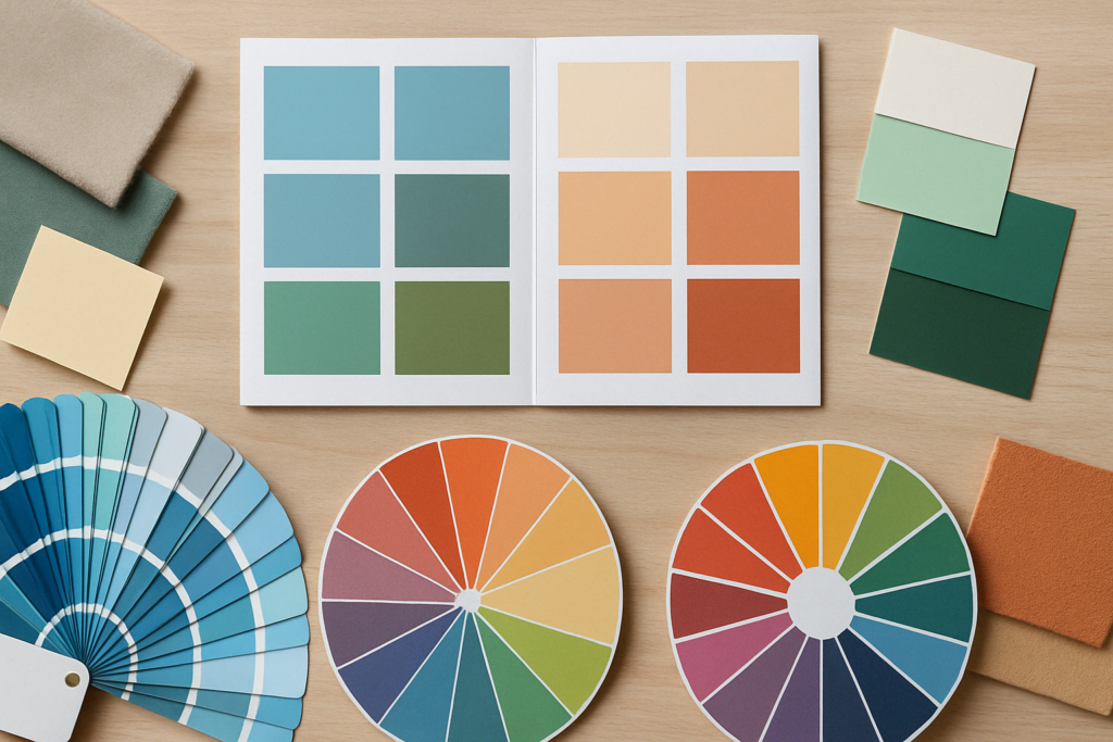
- Create the Right Atmosphere. Colors set the mood: cool tones (blue, green) are great for a relaxing atmosphere, while warm tones (terracotta, cream) create coziness.
- The 60-30-10 Rule. Use primary, secondary, and accent colors in a 60-30-10 ratio: for example, neutral colors for walls, bright colors for furniture, and rich tones for accents.
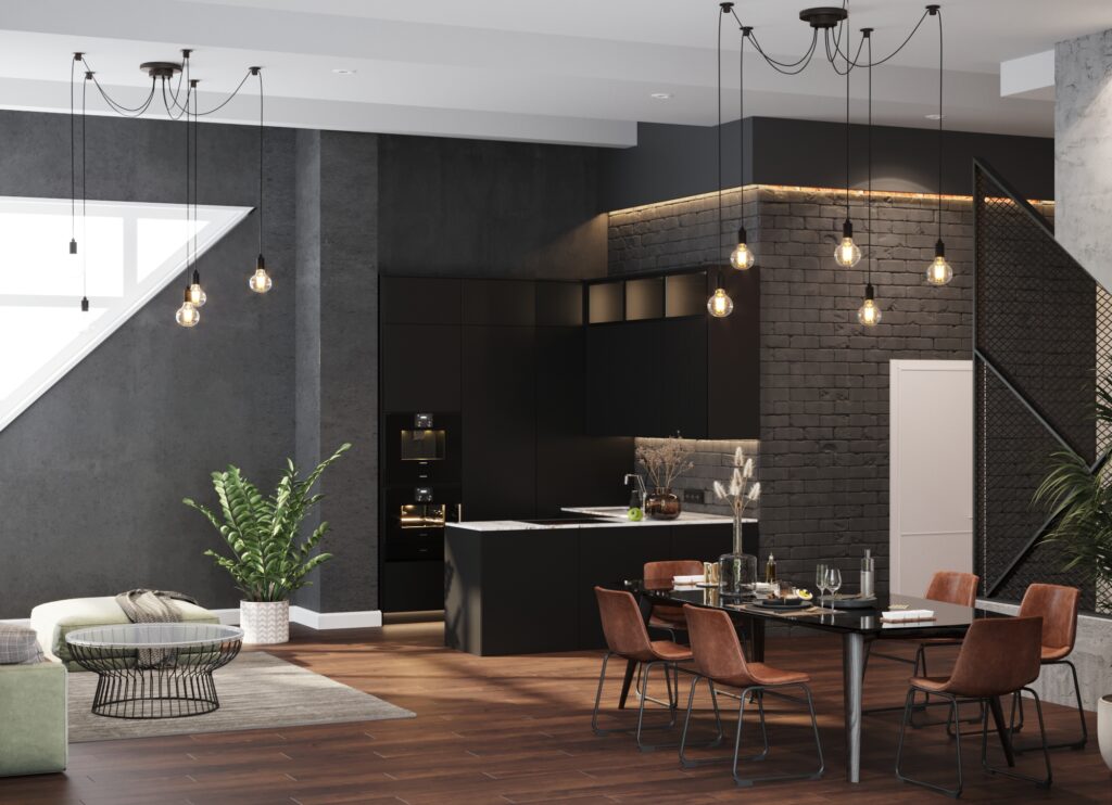
- Consider Lighting. In darker spaces, opt for lighter shades, while darker colors in well-lit rooms create a cozy feel.
- Primary and Accent Colors. Primary colors should be calm and neutral, while accent colors should be bold and saturated. Avoid overcrowding the space with too many colors.
- Function of the Space. For kitchens, choose fresh and vibrant colors (like white or green), while soft, calm shades (pastels) are ideal for bedrooms.
- Nature-Inspired Colors. Nature-inspired tones (earth, sky, plants) blend harmoniously and create a peaceful atmosphere.
The right colors will make your interior stylish and cozy. Keep in mind the mood, functionality, and experiment with different shades for the perfect result.